Lesson#169: What are the 4 most commonly used charts in Excel?

Excel is a powerful tool for data analysis and visualization. Charts and graphs can be used to communicate your data to others effectively. In this blog post, we’ll show you how to use charts and graphs in Excel to make your data more understandable and engaging.
Charts and graphs are excellent tools for visualizing data. They can assist you in identifying trends, patterns, and relationships that you might overlook in raw data. Excel provides a variety of chart types from which to select the best one for your data.
To create a chart or graph in Excel, first select the data you want to include in the chart. Then, go to the Insert tab and click on the type of chart or graph you want to create. A preview of the chart will appear on your worksheet. You can then customize the chart or graph to your liking.
Let’s discuss the 4 most commonly used charts in Excel.
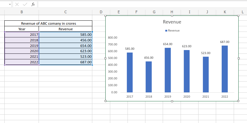
Column Chart
Let’s show you an example of a Column Chart. here in this sheet, I have made a simple data table of a company’s yearly revenue.
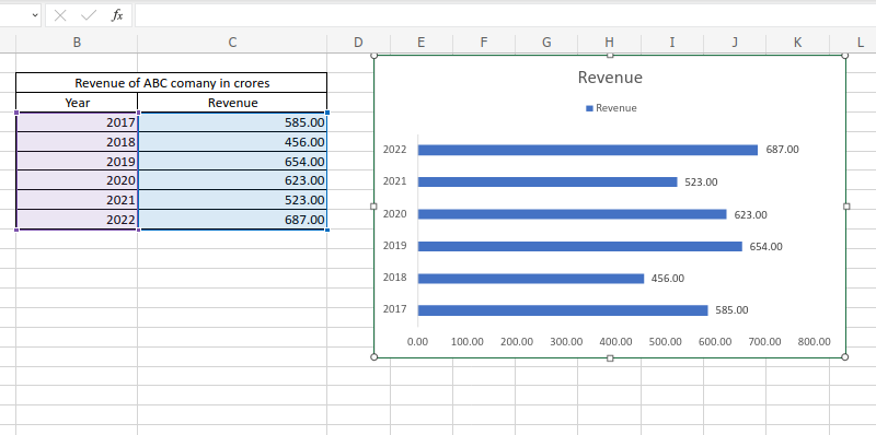
Bar Chart
Now I can change the same chart into a bar chart. I shall select the chart and then click on Insert > Bar
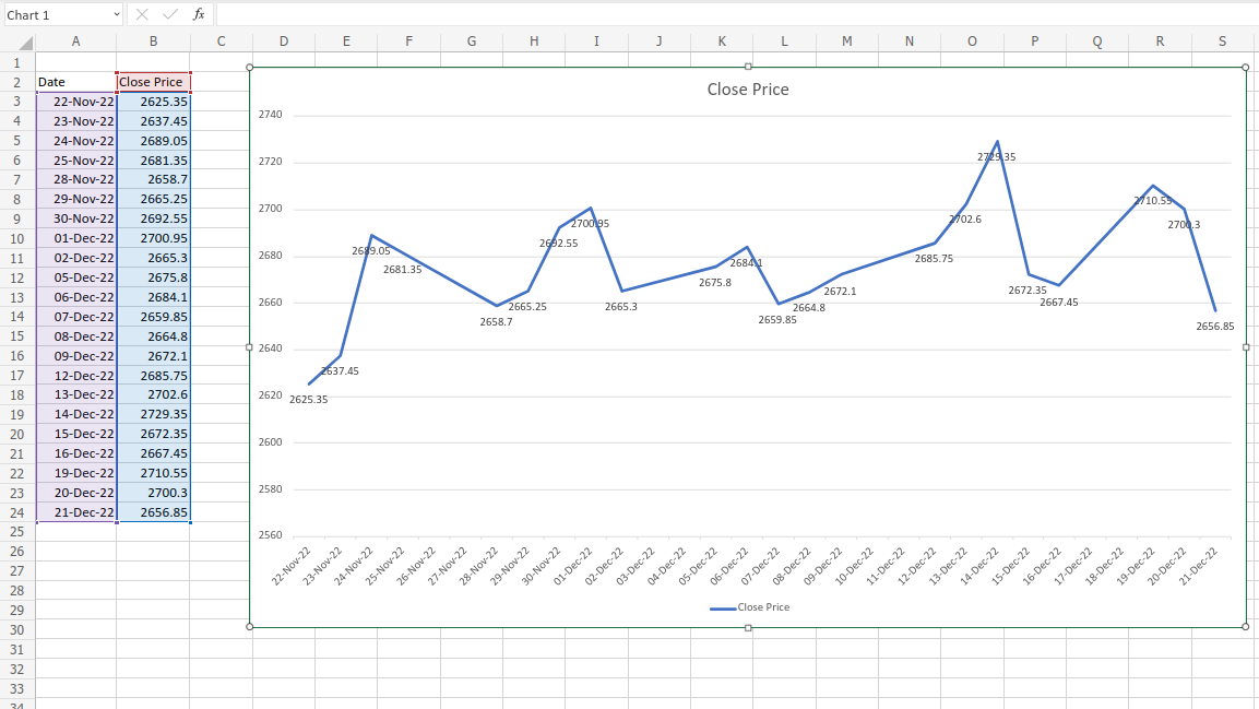
Line Chart
So next talk about the line chart. We have simple data on a stock’s closing price.
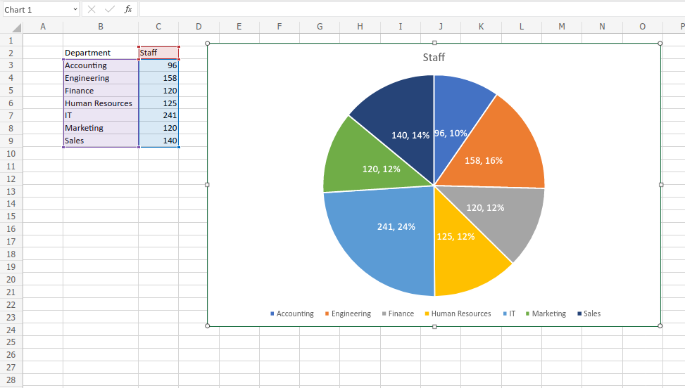
Pie Chart
Now the Pie chart is one of the most commonly used charts. We have simple data on a Company’s stuff.
Hi! I am Pushpendu. I am the founder and author of Excelabcd. I am little creative person, blogger and Excel-maniac guy. I hope you enjoy my blog.