Lesson#168: How to analyze employee database with PivotTable

Ok readers! How are you? Today I brought a lesson on how to analyze employee database with PivotTable. Here I have a company database with records of 1,000 employees. Employee ID, Job Title, Department, Business Unit, Gender, Salary, and other fields are included in this database.
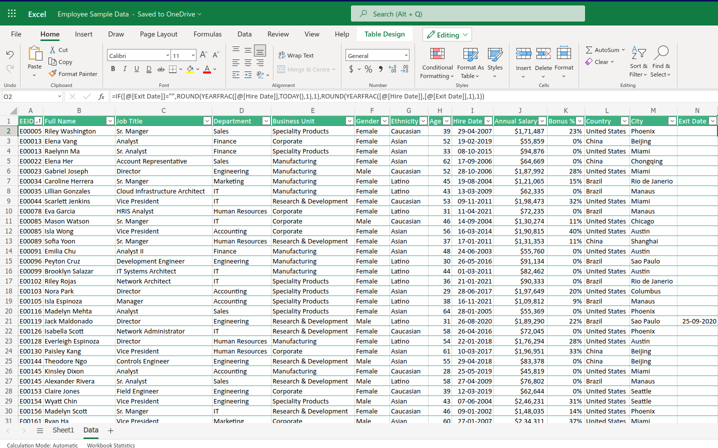
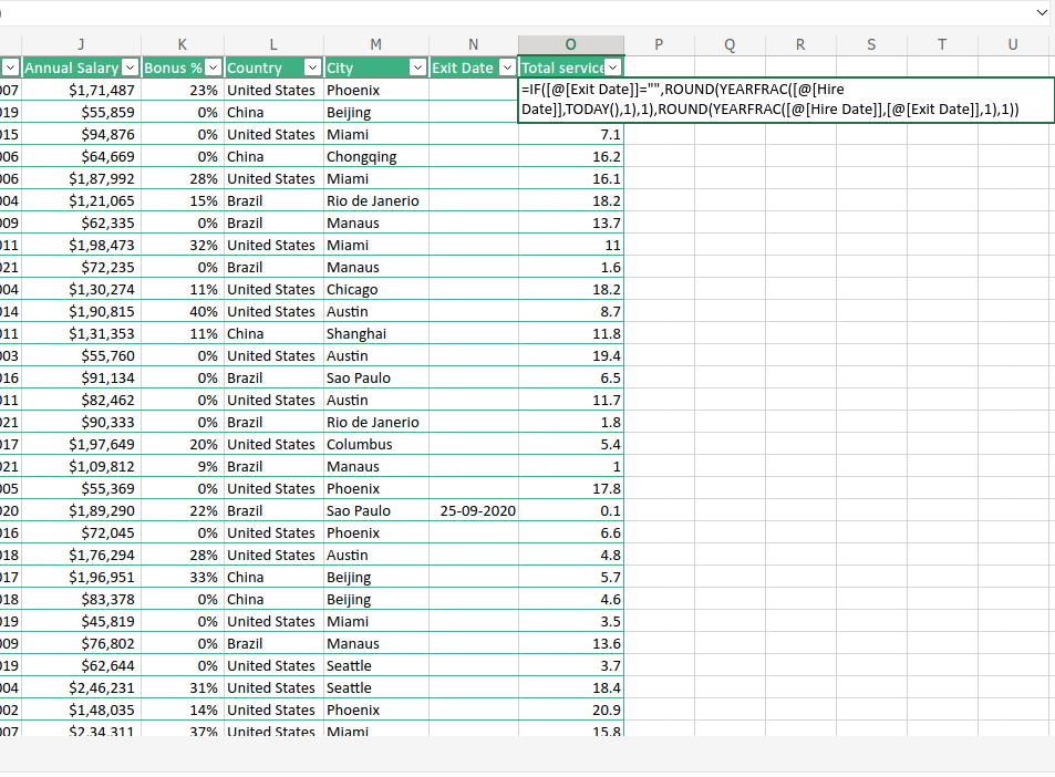
Here I have added another column beside the Exit Date which shall show the ‘Total Years of Service’ in the company. So I did apply this formula.
=IF([@[Exit Date]]=””,ROUND(YEARFRAC([@[Hire Date]],TODAY(),1),1),ROUND(YEARFRAC([@[Hire Date]],[@[Exit Date]],1),1))
Who gets paid higher? Male or Female?
Let’s insert a Pivot Table after selecting the whole table.
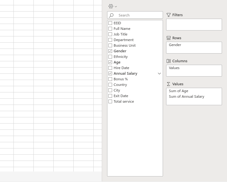
I shall insert three entities only in the Pivot Table. I shall put ‘Gender’ in the Row and ‘Sum of Age’ and ‘Sum of Annual Salary’ in the Values.
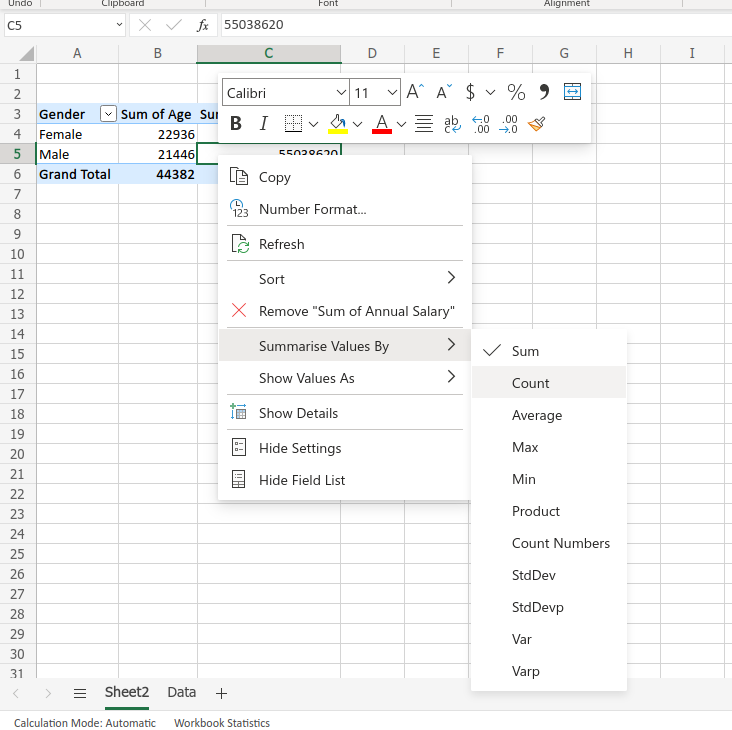
Now I shall right-click on the columns and click on Summarise Values By > Average
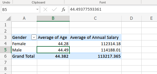
It shows that the average age is almost the same but Men get a higher salary than Women. Now I shall check the department-wise average salary of Males and Females.
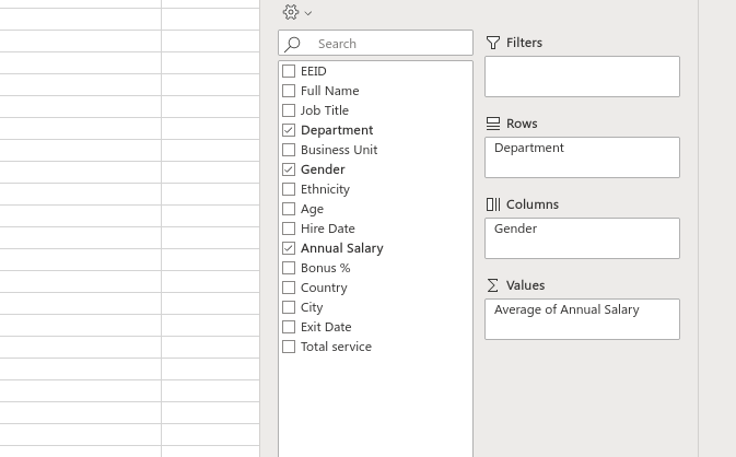
For that, I have put Department in the Rows and Gender in the Columns. ‘Average of Annual Salary’ in Values. The average of data is selected as I have shown before.
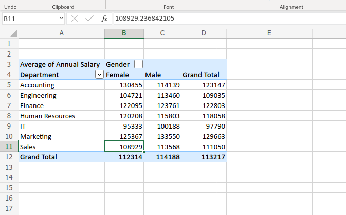
Here is the result.
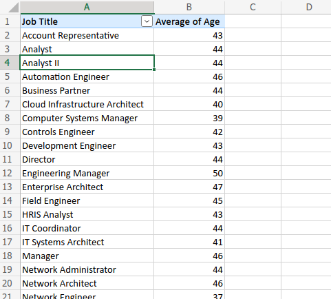
What is the Average Age in different Job Titles?
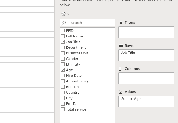
I have put the Job title in Rows and the age in values.
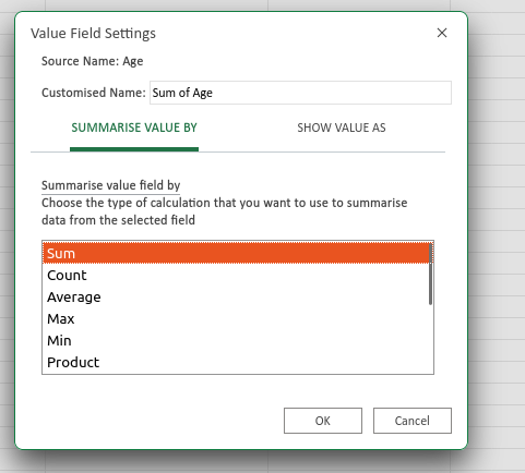
Now click on the sum of ages that will show a down arrow and click on it. This window will pop up like in the above picture. Change it to Average and it will show the average age of the employee in each job title.
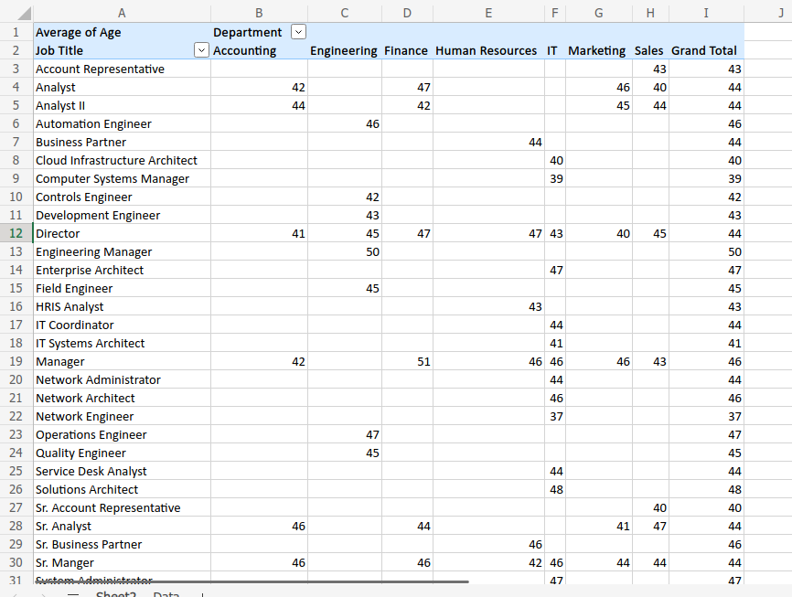
Now I can represent the data in any way like I can add ‘Department’ or ‘Business Unit’, whether I can put it in columns or rows.
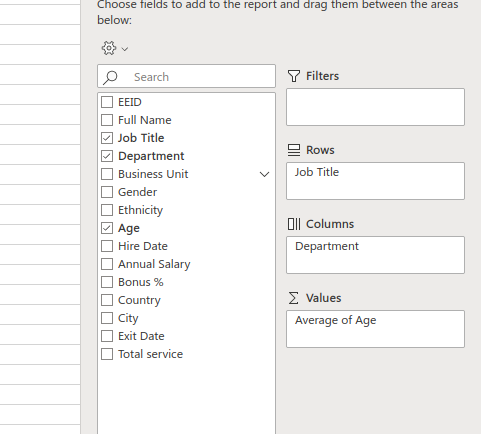
I have added ‘Department’ in Columns.
How to analyze employee database using a chart in Pivot Table
Let’s say I want to make a Pie chart of the number of employees department-wise.
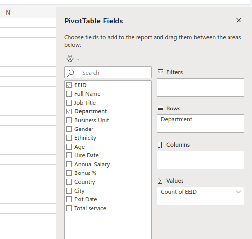
I shall put ‘Department’ in the Rows and ‘EEID’ in the Values and I shall set the field settings as COUNT.
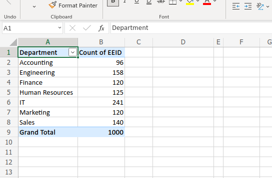
This is the result, you can see.
Now I am going to insert a Pie Chart to represent the data visually.
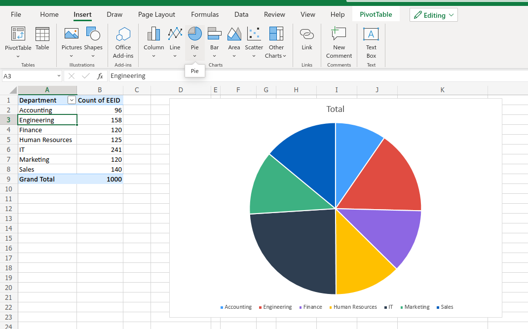
After clicking on the Table, I shall go to the Insert tab and click on Pie Chart.
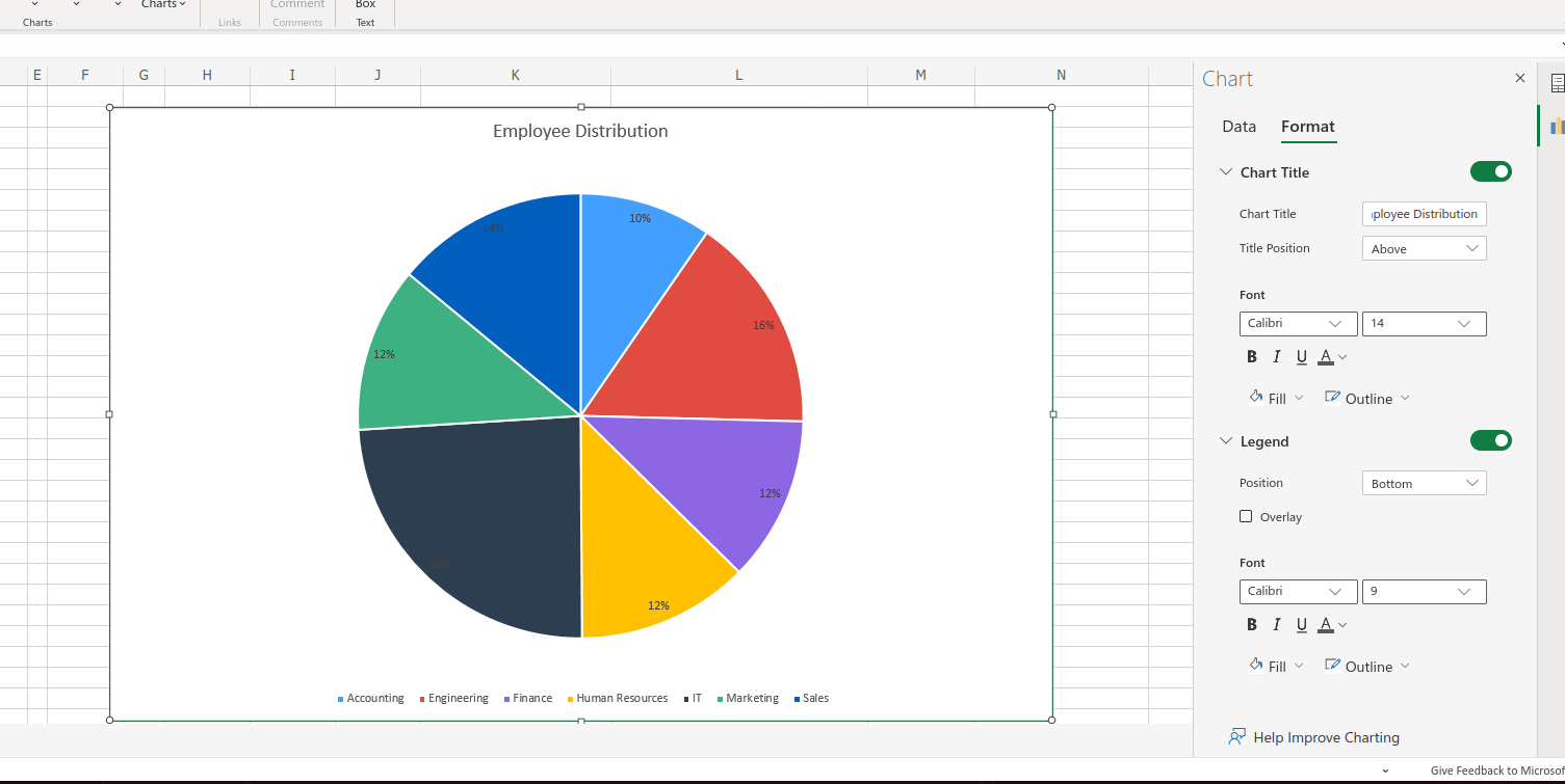
Now for more modification you can right-click on the chart and click on the format then you can change Title, Data format, and many things.
I hope you have got a brief idea about how to analyze employee database with PivotTable and using PivotTable makes your work very easy. You can change your data representation and filter or analyze it as your wish.
If you liked this post then please subscribe to our YouTube channel also.
Hi! I am Pushpendu. I am the founder and author of Excelabcd. I am little creative person, blogger and Excel-maniac guy. I hope you enjoy my blog.