Lesson#89: Example of a bar chart with life expectancy data

Hello reader. This post is a discussion about an example of a bar chart making with life expectancy data of all countries.
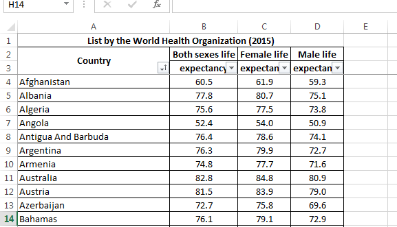
Here I am having data in 4 columns. Country, Both sexes life expectancy, Female life expectancy, Male life expectancy. I will represent this data with help of a bar chart.
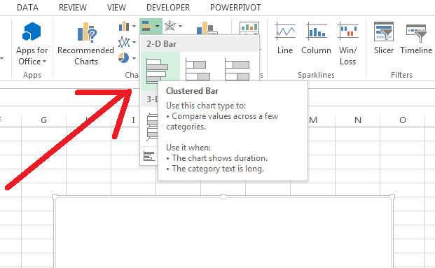
In a different sheet, you go to Insert>Charts>Bar Chart
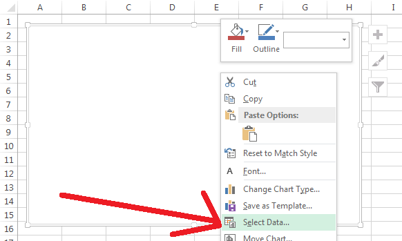
A blank chart will appear like the above picture. There you right-click on the blank chart and click on Select Data.
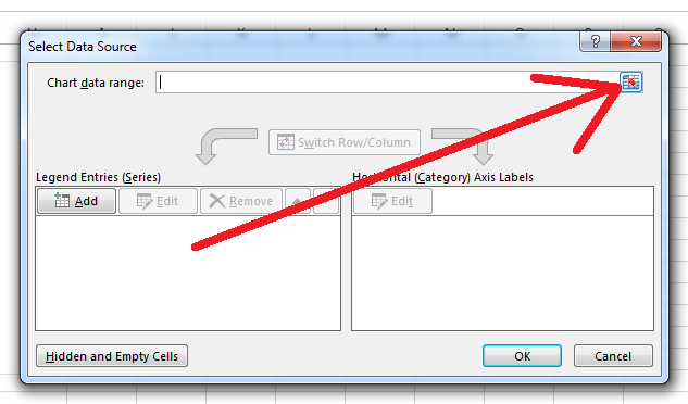
Click the button beside the Chart data range
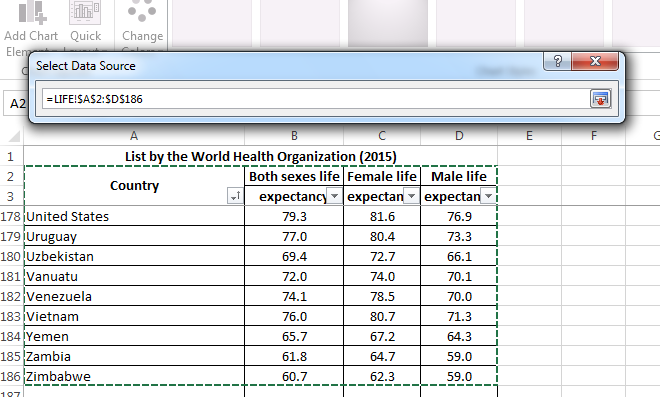
There you have selected the data including the column headings.
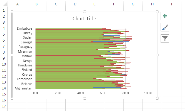
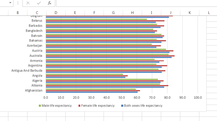
And the chart will appear like this. There you have to make some changes. You have to increase the chart area by dragging the corner down and you can change the layout.
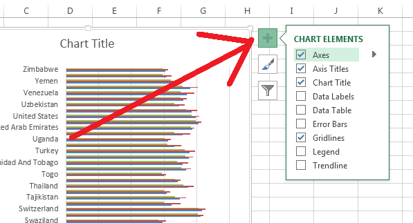
You can add fields to the chart by clicking the “+” button in the upper right corner of the chart or
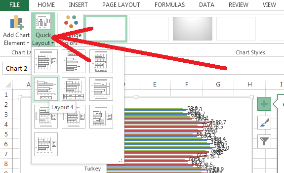
You can click on Quick Layout to change the layout of the chart.
So I have shown you how to make a bar chart. More different types of chart examples I will show in my next posts.
Hi! I am Pushpendu. I am the founder and author of Excelabcd. I am little creative person, blogger and Excel-maniac guy. I hope you enjoy my blog.