Lesson#58: How to analyse data with Pivottable

PivotTable has very powerful features to analyze data. One of them is PivotChart. PivotChart is a different feature of Pivot Tools to represent the PivotTable data with the chart. Here I am having a practice with the employee database and sharing with you how to use it.
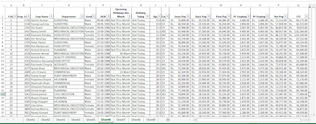
The employee data table is having the following fields S No, Emp. Code, Department, Gender, DOB, Upcoming Birthdays this Month, Birthday Today, Age, Cadre, Gross Pay, Basic Pay, Flexi Pay, PF Employee, PF Employer, Net Pay, CTC
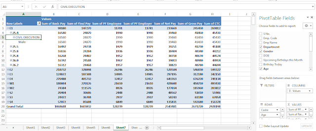
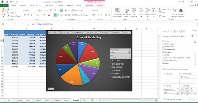
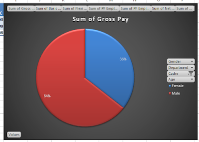
I have made a Pivot Table from the data table In Rows I have selected Cadre, Age, Gender, and Department. And in Values, I have selected Gross Pay, Basic Pay, Flexi Pay, PF Employee, PF Employer, Net Pay, CTC
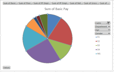
Selected the table data and inserted this Pie Chart from PivotChart in PivotTable tools.
Here we can change the chart design or layout from PivotChart tools.
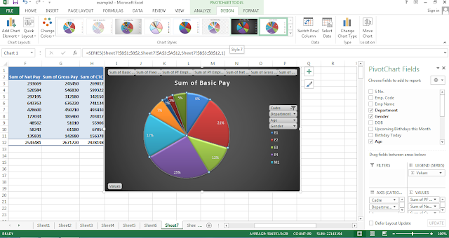
Changing the field order we can change the chart. In the above pictures, it has shown that I have changed the chart axis field categories from cadre to the department.
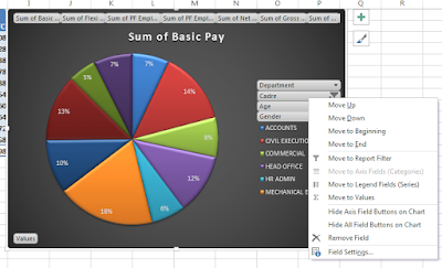
Right-clicking on field names shown in the chart shows us options of moving it up or down, to beginning or end. It shows options to change the field location from the axis field (categories) to or legend field (series).
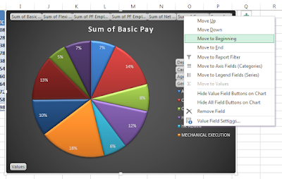
Yes, we can change the chart data very easily by moving it up or down or changing the location in PivotChart. So it is a very advanced tool for analyzing data.
Here I have provided the sample file download link. You can download and exercise on it.
Hi! I am Pushpendu. I am the founder and author of Excelabcd. I am little creative person, blogger and Excel-maniac guy. I hope you enjoy my blog.