Lesson#225: Fixing Excel Chart Data Source Problems: An Expert Guide
Creating charts in Excel is a powerful way to visualize data and communicate insights effectively. However, working with Excel charts can sometimes be frustrating, especially when you encounter issues related to data source problems. In this expert-level guide, we’ll delve into the techniques and strategies for fixing Excel chart data source problems, ensuring that your charts accurately represent your data and helping you overcome common challenges in Excel charting.
Understanding Excel Chart Data Source Problems
Excel chart data source problems can occur for various reasons, and they often manifest as issues such as:
- Data Not Updating: When you add or modify data in your worksheet, your chart may not reflect these changes, leaving you with outdated or incorrect visuals.
- Incorrect Data Ranges: Charts might display incorrect data if the data range specified for the chart is not accurate or if it includes extra rows or columns.
- Missing Data: In some cases, data points may go missing from your chart, leading to incomplete or inaccurate representations.
- Data from Wrong Sheet or Workbook: If your Excel file has multiple sheets or workbooks, your chart might be referencing the wrong data source, causing discrepancies.
- Named Ranges Issues: Charts using named ranges can run into problems if the named ranges are incorrectly defined or not updated to include new data.
Now, let’s explore the expert techniques to tackle these Excel chart data source problems.
Fixing Excel Chart Data Source Problems
1. Updating Data Range:
If your chart is not reflecting the most recent data, you may need to update the data range:
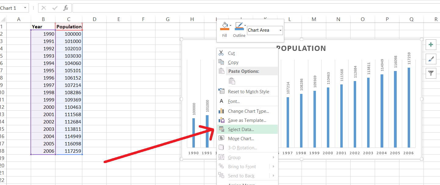
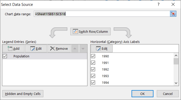
- Right-click on your chart and select “Select Data” from the context menu.
- In the “Select Data Source” dialog box, check if the data range specified in the “Chart data range” field is accurate.
- Adjust the data range as needed by clicking on the “Edit” button and selecting the correct range in your worksheet.
- Click “OK” to update the chart with the new data source.
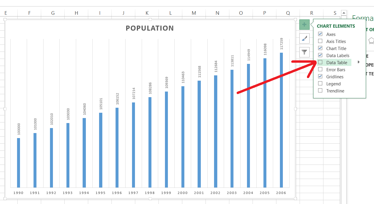
2. Data Table:
Adding a data table to your chart can help you identify discrepancies between your chart and the data source. To add a data table:
- Right-click on your chart and select “Show Data Table” from the context menu.
- A table will appear below your chart, displaying the data points used in the chart.
- Compare this table with your data source to identify inconsistencies.
3. Check for Hidden Rows or Columns:
Hidden rows or columns in your data source can affect your chart. Unhide any hidden rows or columns that are part of the data range used by your chart.
4. Use Dynamic Named Ranges:
Named ranges can be a convenient way to specify your data source, but they can become problematic if they’re not dynamic. To create a dynamic named range:
- Select the data in your worksheet.
- Go to the “Formulas” tab and click “Define Name.”
- In the “New Name” dialog box, specify a name for your range.
- In the “Refers to” field, enter a formula that dynamically adjusts to the size of your data range. For example, you can use the
OFFSETorINDEXfunctions. - Click “OK” to create the dynamic named range.
- Update your chart’s data source to use the newly created dynamic named range.
5. Data Source in Multiple Sheets or Workbooks:
If your Excel file contains multiple sheets or workbooks, confirm that your chart is referencing the correct data source:
- Right-click on your chart and select “Select Data.”
- In the “Select Data Source” dialog box, ensure that the “Chart data range” field specifies the correct sheet and range.
- If your data is in a different sheet or workbook, you may need to browse to the correct location and select the data.
Troubleshooting Advanced Data Source Problems
If you encounter more advanced data source problems, consider these expert techniques:
- Use Pivot Tables: Pivot tables can provide a structured and organized data source for your charts. They can also handle changes and updates in your data more efficiently.
- Excel Tables: Converting your data into an Excel table (ListObject) can make it easier to work with dynamic data sources for your charts.
- Dynamic Arrays: If you’re using Excel 365 or Excel 2019, consider using dynamic array functions to create flexible data sources for your charts.
Conclusion
Fixing Excel chart data source problems is a vital skill for anyone who regularly works with data visualization in Excel. By mastering these expert-level techniques, you can ensure that your charts accurately represent your data, even when faced with complex data source challenges.
Remember that data source problems can vary, and it’s essential to diagnose the specific issue you’re encountering. Whether it’s updating data ranges, using dynamic named ranges, or employing more advanced solutions like pivot tables, Excel provides a range of tools to help you overcome data source problems and create informative, accurate charts that effectively convey your data insights.
Hi! I am Pushpendu. I am the founder and author of Excelabcd. I am little creative person, blogger and Excel-maniac guy. I hope you enjoy my blog.