Lesson#55: Some examples where Pie Chart can be used

In this post, I will discuss some examples where Pie Chart is applicable.
Pie Chart is generally used to show percentage or proportional data.
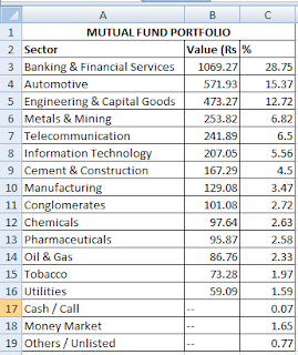
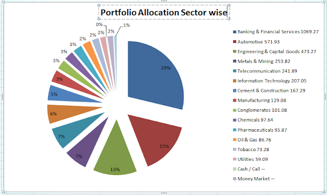
Here I have downloaded a mutual fund portfolio allocation data sector-wise in the stock market. I will apply Pie Chart to represent these data in a graphical way.
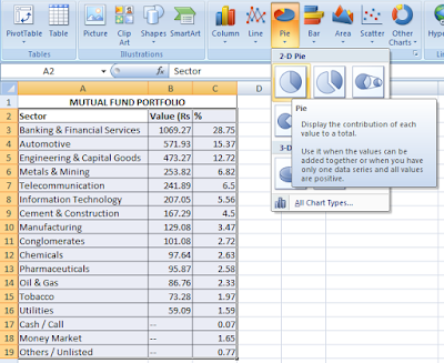
Selected the whole table then Insert> Charts> Pie
Click on any 2D or 3D pie
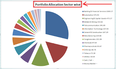
.You can change the chart title here (Shown in Red Box).
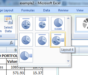
You can change the chart layout from Charts> Chart Layout
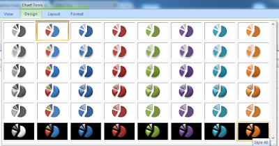
Change the design of the chart from Chart Tools> Design
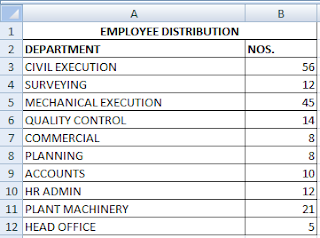
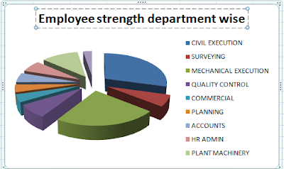
Another example I will show you here. Here is a data table of a construction project showing employee numbers department-wise. I have applied Pie Chart to those data.
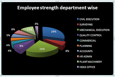
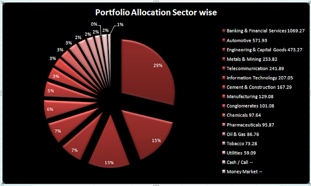
Here I have changed the design and layout.
Hi! I am Pushpendu. I am the founder and author of Excelabcd. I am little creative person, blogger and Excel-maniac guy. I hope you enjoy my blog.